How does flying compare?
Is avoiding flying always the greenest option? What about the pollution created by ferries or driving? We take a look at the figures.

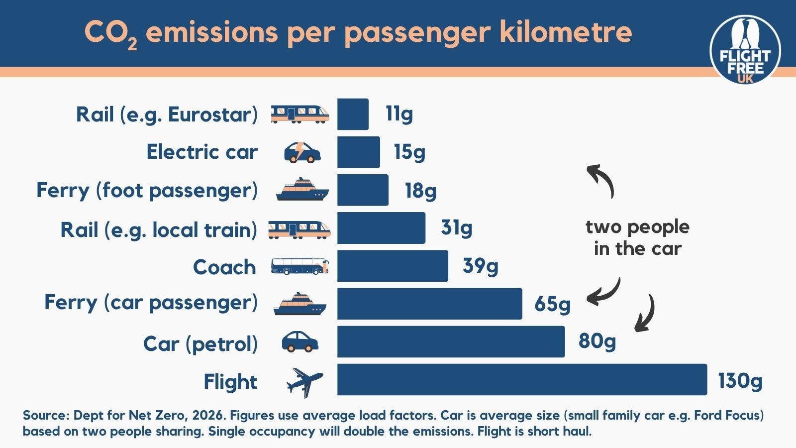
There are lots of options for travelling without flying. By far the most low-carbon of them all is the train.
The top bar in this chart refers to international high-speed rail across Western Europe, including the Eurostar. The majority of the electricity in Western Europe comes from renewables and nuclear, so it’s very low-carbon. Electric trains in the UK are also very good for keeping your emissions down, but aren’t quite as low carbon as in Europe.
Next is electric car, which is a fantastic option – much better than a diesel or petrol car – although the figure changes depending on where the electricity comes from when you charge it. The figure in this chart is for typical electricity generation in the UK. This also refers to two people being in the car, which is the closest you can get to average occupancy (technically 1.6, but that’s impossible).
The next in the list can be surprising: it’s travelling on the ferry as a foot passenger. Most of the weight and space in the ferry is taken up by motor vehicles and freight, so travelling as a foot passenger or with a bike means your share of the emissions is very low.
***A note about ferries compared to cruise ships. Ferries are geared towards transport, and while they might have a bar, food, toilets and in some cases a sleeping cabin, their primary aim is carrying as many people as possible from point A to point B. A cruise ship’s primary aim is to keep everyone on board entertained, often for days at sea. This includes cinemas, theatres, ice rinks, karaoke, a whole ‘street’ of bars and restaurants, swimming pools, jacuzzis, a surf wave, and luxury cabins. The energy demands, and therefore the emissions, of keeping all that going is extremely high. Cruising as a form of transport is about the highest-carbon option out there – much more than a flight.***
The local train comes further down than international rail, simply because most local lines in the UK and within Europe either use electricity or diesel, and this figure takes into account that mix. If it’s an electrified local line, the emissions will be lower, and if it’s a diesel line, they’ll be higher. The precise figure is hard to pin down as there are so many variables, but it’s a good guide.
Next is coach, which is a great low-carbon option, and a good budget option. There’s an excellent coach network across Europe, with companies like Flixbus running long-distance and overnight coaches.
If you are taking your car on the ferry you account for more space, therefore more of the emissions, as compared to a foot passenger, which explains why the second bar for ferry emissions is quite a lot higher. Again, this is if there are two people in the car – so for a family of four, halve that number.
Driving is a good option if you have mobility considerations, or need to take a lot of luggage or equipment – or just fancy the road trip. It there are two of you in the car, the emissions are lower than flying, although it does depend on the type of car you are driving. Generally, the older or larger the car, the higher the emissions.
The final bar shows the flight emissions for an economy-class short-haul flight, which is how most people travel to Europe, and which has the highest carbon footprint of all. With such a variety of alternatives, we recommend avoiding the flight, and enjoying the journey instead!
Good stats, but I don't understand the logic of EV calculations v the train. Both use the same electricity mix, but you include a factor for the 'battery'. Presumably you mean the embedded cost of creation, but this isn't included on other calculations. For it to be comparable, surely you need to consider the embedded carbon cost of an engine and carriages? Otherwise there is unnecessary implicit bias against EVs v train travel
Update 18/06/26: the chart has been updated with the latest government figures released in 2026, which are a bit different to the 2023 figures we used previously. Emissions of transport modes is changing all the time depending on new technology and advancements with renewable energy, so we try to periodically update our stats and graphics. The broad picture usually remains the same, i.e. train is always at the top, plane at the bottom.